Following this guide will help you create an accessible Word document (and thus, PDFs) for all your students. Using accessible course materials is essential, so every student has an equitable chance of succeeding in your online course(s).
The key elements to developing an accessible Word document:
- Alternative Text for Images
- Headings
- Descriptive Hyperlinks
- Contrast & Color
- Data Tables
- Accessibility Checker
- Document Title
- Converting to an Accessible PDF
Create an Accessible Word Document
Alternative Text for Images
Images meant to convey meaning should contain an alternative or “alt” text description. When a student using a screen reader encounters an image in Word, their screen reader reads the description for them.

See How to Create Accessible Images for more information. Also, there are many writing alt text resources available.
Headings
Headings are essential to Word documents because they give your document structure. This hierarchical structure allows students to scan your documents visually or with a screen reader. But scanning only works if the hierarchy is well formed.
You can create headings by using Word’s built-in styles on the ribbon’s Home tab.
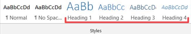
For more information, check out our How to Create Accessible Headings tutorial. (In addition, see our well-formed heading hierarchy example.)
Descriptive Hyperlinks
Hyperlinks should:
- Be descriptive and meaningful out of context
- Help people know where they’re going
Descriptive hyperlinks give meaning to where the URL in the background will take you. You’ve seen several descriptive hyperlinks already throughout this guide (and yet, no URLs).
Screen reader and keyboard-only users can skip from link to link by pressing the Tab key on their keyboard. Therefore, if links don’t make sense on their own, we’re not providing enough information.
See our How to Create Accessible Links tutorial, where we discuss good and bad hyperlink examples. WebAIM has more to say about links and screen readers, helping you form better descriptive link text.
Contrast & Color
Contrast
So all students can read your content without difficulty, text and its background color should have sufficient contrast. Be aware of colors that may be problematic for students with color blindness.
You can find insufficient color contrast by using Word’s Accessibility Checker.
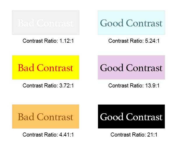
The highest and best possible contrast is black text on a white background or white text on a black background. The worst contrast example here is off-white text on a white background.
Additional tools can help you find better colors to use in your documents and web pages. Check out Just Color Picker and WebAIM’s Contrast Checker to help you choose. You may only need to darken your text to find a better contrast ratio.
Use of Color
See our Contrast & Color Accessibility tutorial to see why we shouldn’t use color alone to describe something.
Data Tables
Data tables display information in a grid or matrix. They contain header columns and/or rows that explain what the information in the grid means.
Sighted students can scan tables to make associations between table data and corresponding headers. When you set table properties correctly, table headers provide those associations for students using a screen reader.
Read How to Create Accessible Tables to see how to set up your tables properly.
Accessibility Checker
Office products, like Microsoft Word, have an internal Accessibility Checker. These can help you find and fix many accessibility issues within your documents.
However, automated accessibility checkers can only find so many issues (about 30%). Thus, we should follow the guidelines seen throughout this tutorial. Adhering to these guidelines and using the accessibility checker helps ensure you create accessible documents for your students.
Add a Document Title
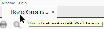
If you plan to convert your Word document to a PDF (e.g., for sharing), add a document title first. Screen readers read this title to students instead of the filename. Accordingly, the document title should be an easy-to-read replacement. (Copy and paste your document’s Heading 1; that would likely suffice.)
Sighted students will see this title instead of the filename on Adobe Reader’s PDF tab. Again, students using a screen reader hear this title instead of the filename. Therefore, this title should be helpful for all your students.
Unfortunately, Word’s Accessibility Checker doesn’t flag a missing document title as an accessibility issue. So, you’ll have to remember on your own, refer to this guide, or be reminded by Canvas upon uploading the PDF. Luckily, you’ll have multiple chances to get it right for your students.
Converting to an Accessible PDF
Instructors primarily use PDFs for their students’ online course materials. Regardless of their reasons, there are many benefits to providing PDFs for your students instead of the original document.
Adobe PDFs can be shared, viewed, and printed by anyone on any system using free Adobe Reader software. Regardless of your operating system or the original application used to build the document, anyone can access that PDF. (If it’s accessible, that is.)
Once you’ve fixed all accessibility issues, then you can convert your Word document into an accessible PDF. Please see How to Convert a Word Document into an Accessible PDF for detailed instructions.
Conclusion
Word’s Accessibility Checker can’t find all issues for you, so adhering to this guide can help. It greatly increases the likelihood that you’ll create an accessible Word document. Therefore, every student benefits and gets an equitable chance to succeed in your online course.

Leave a Reply